Context
Azure Quickstart Center is the designated front door for new Azure users — a place to learn the platform and deploy their first service. But three signals told us it was failing at that job: users took months (sometimes years) to deploy their first service, ~600K visitors came each quarter (80% first-timers) and most left without deploying anything, and a meaningful share of users didn't even know AQC existed.
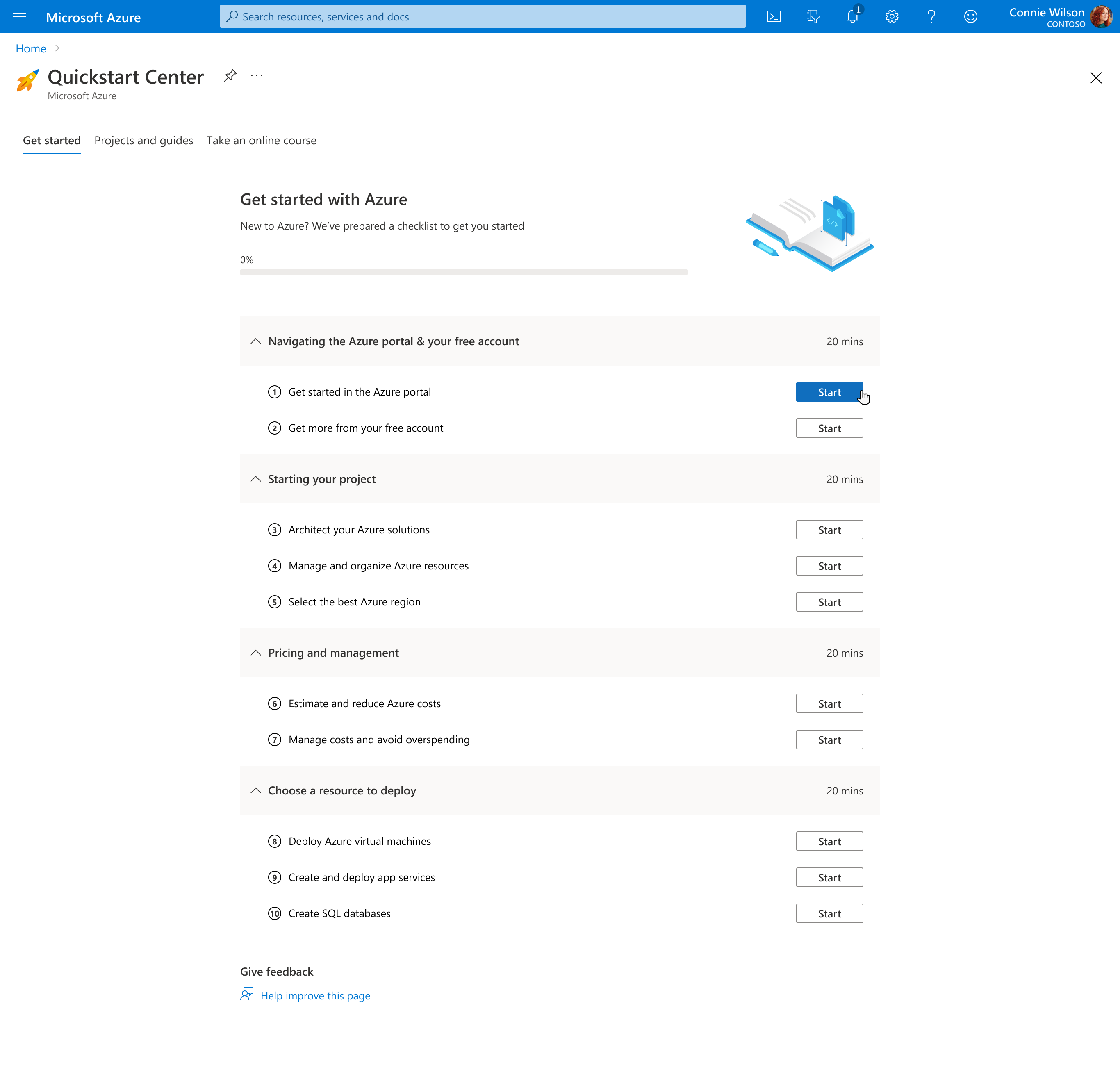
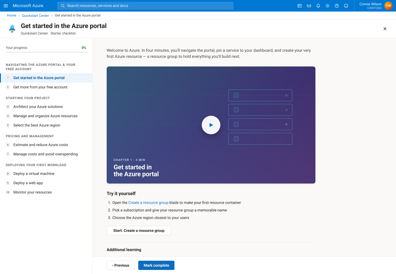
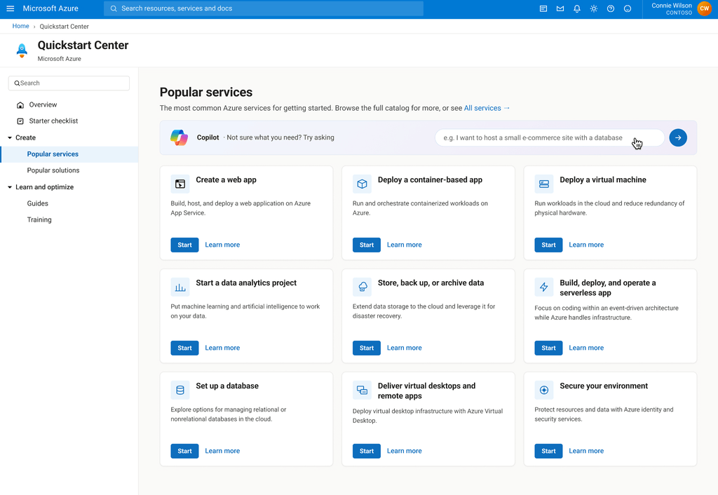
The original Quickstart Center
Discoverability wasn't the bottleneck
Before committing to a redesign, we tested the cheapest hypothesis first: maybe users just couldn't find Quickstart Center. We redirected new users to AQC immediately after first login. The result was a null — no statistically significant lift. That null result became the case for redesigning the experience itself.