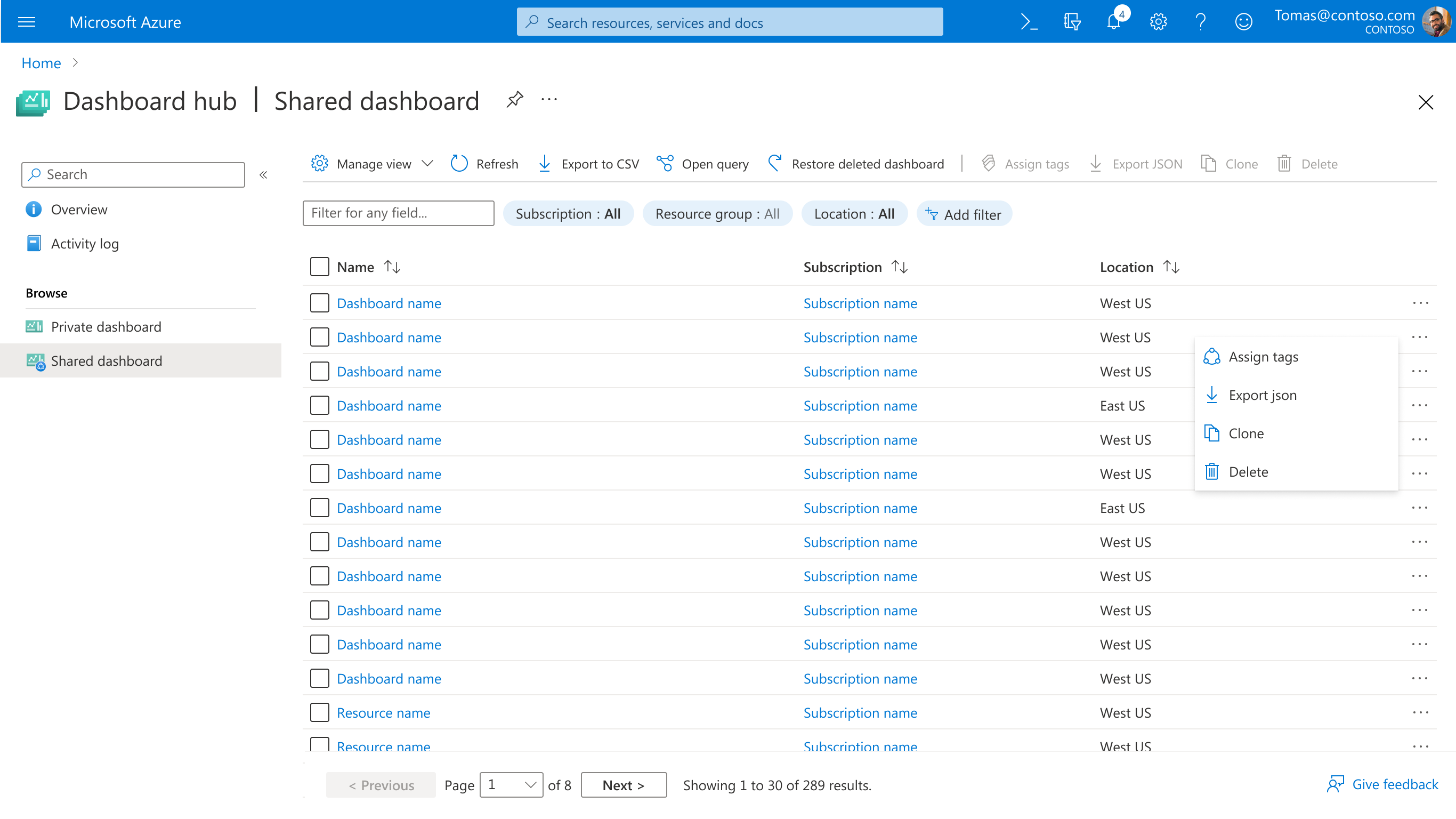
Hub Design Patterns
A Hub groups related services and resources to help users discover, compare, and manage across resource boundaries. This project established visual patterns to make hubs consistent and modern across Azure.
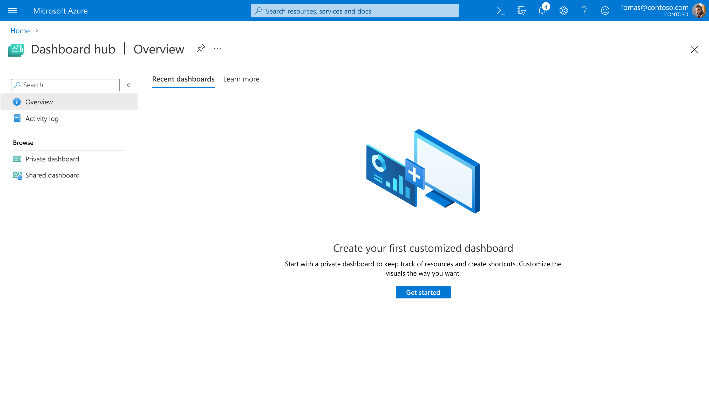
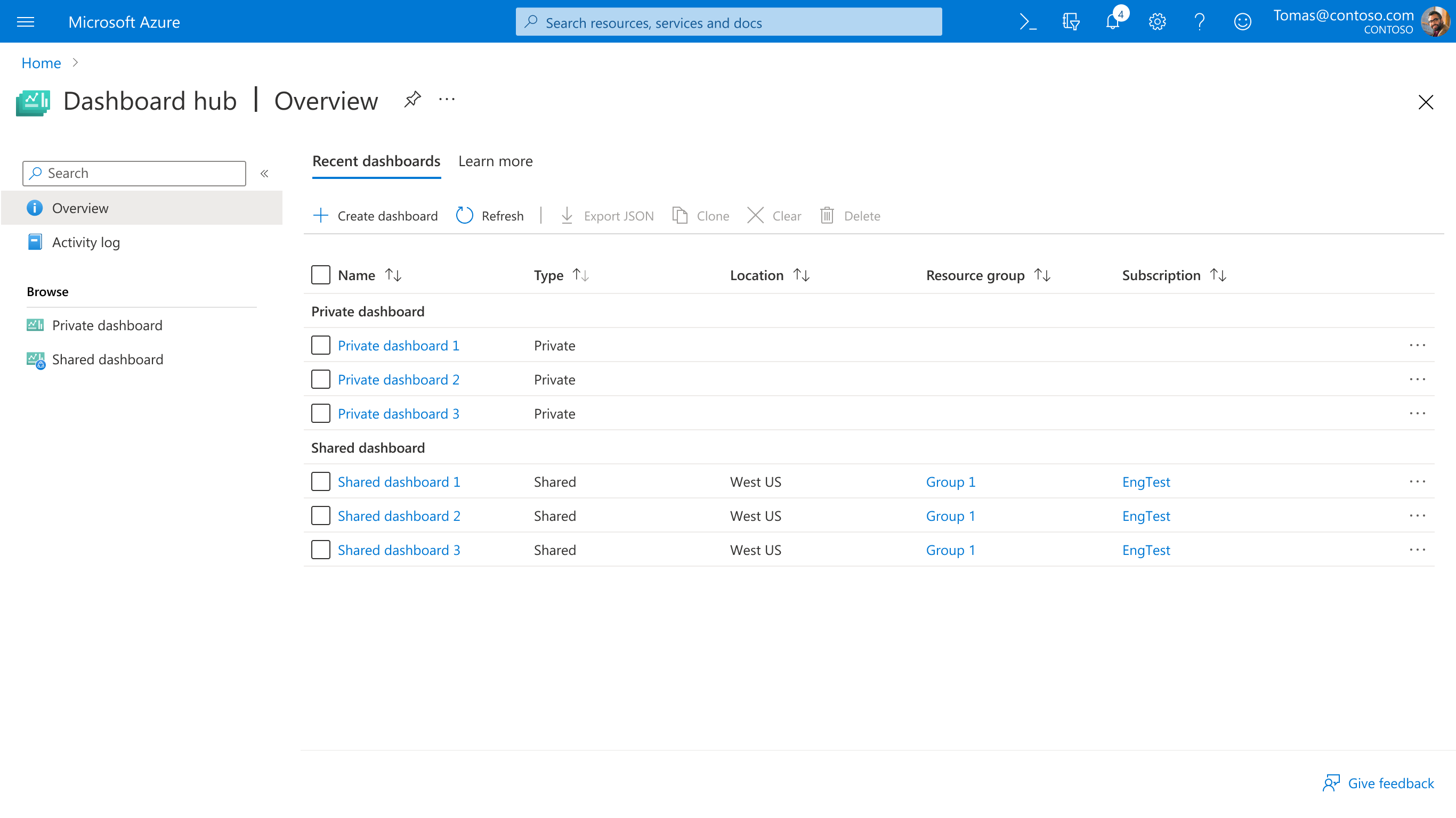
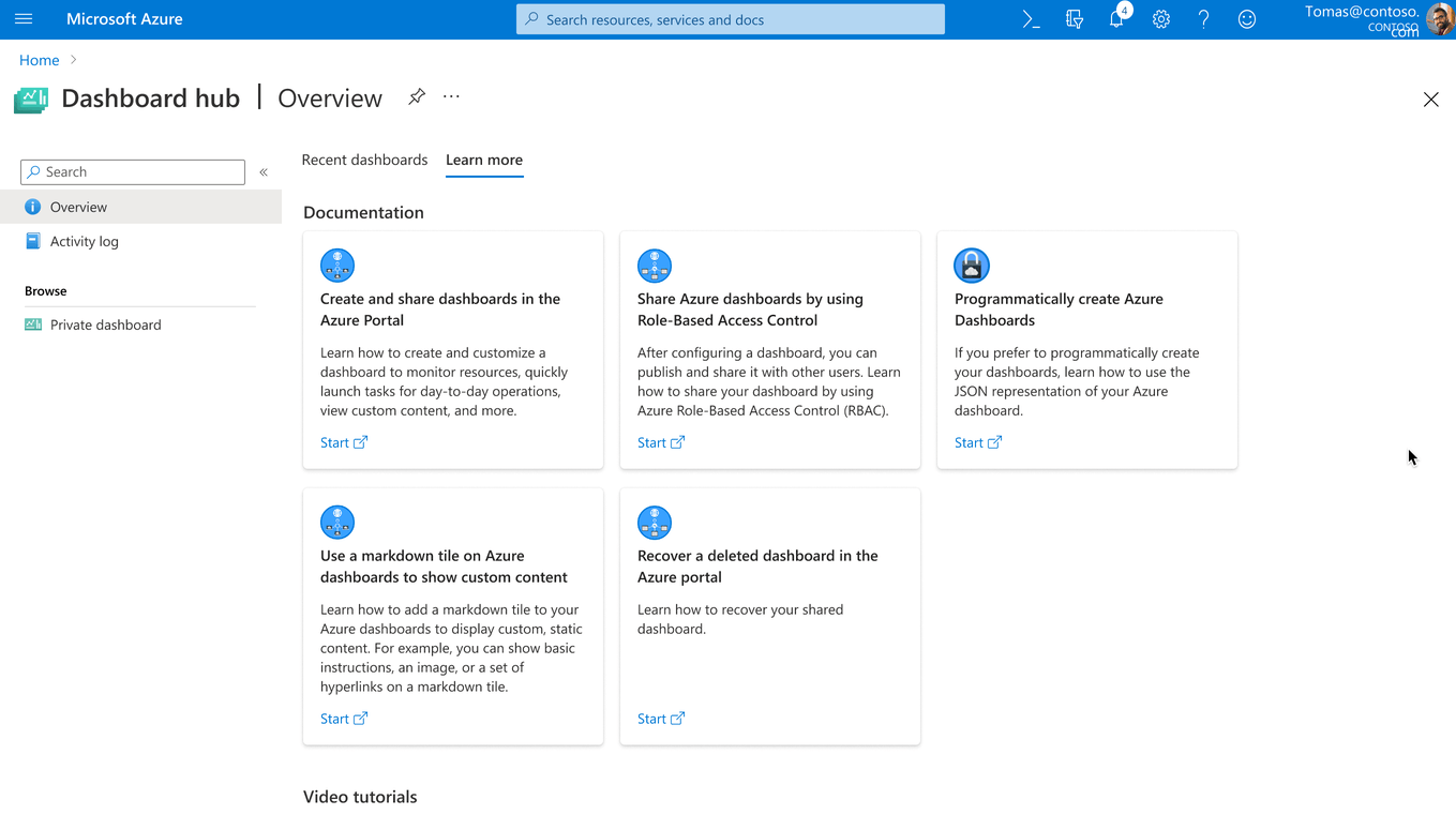
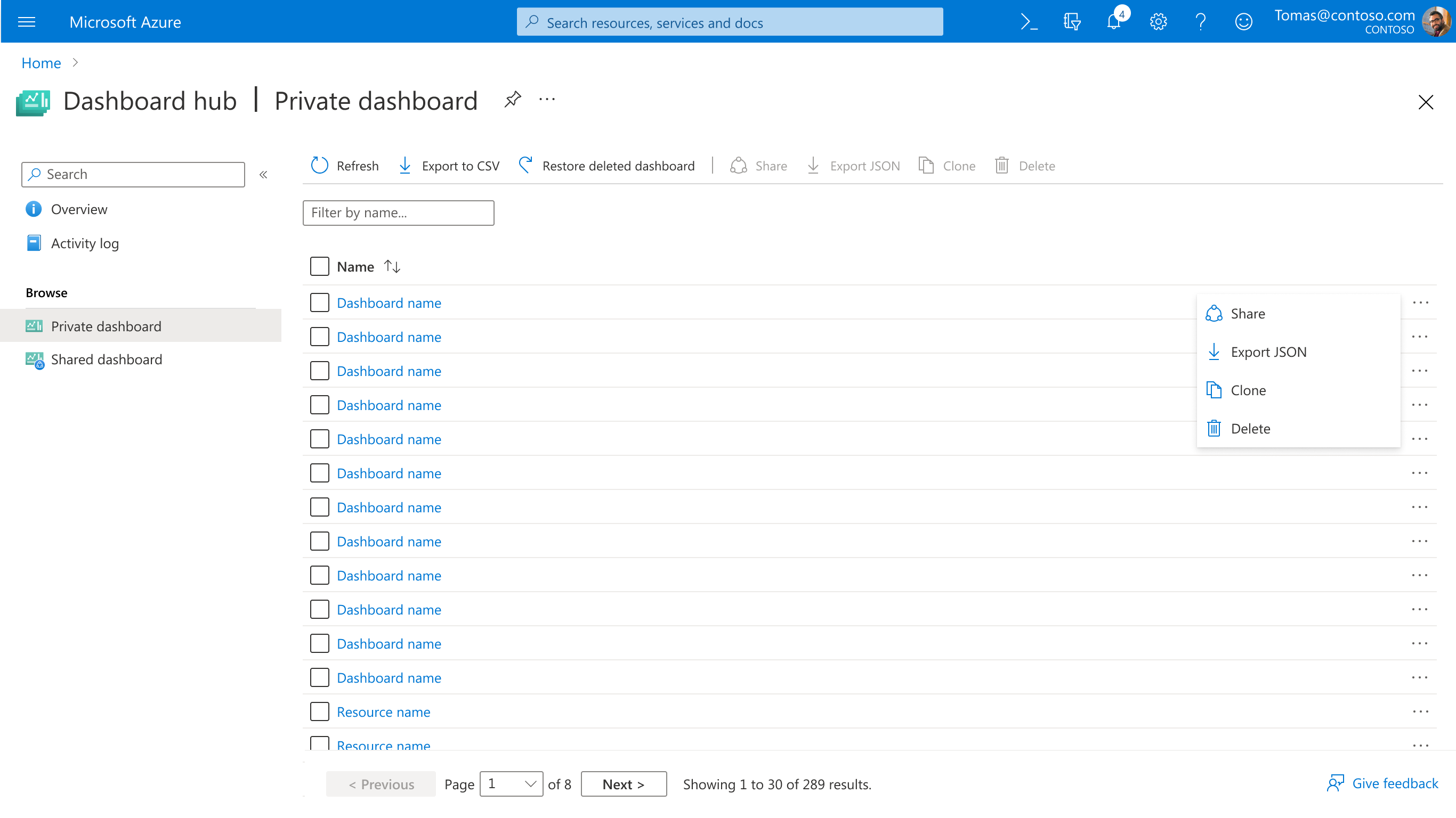
What is a Hub?
A grouping of services or resources for related scenarios, with goals to consolidate discovery, enable comparison of services, and support management tasks beyond individual resource boundaries.
Problems & Opportunities
As multiple teams built hubs independently, inconsistencies emerged. PM feedback indicated that hubs needed to be more consistent before release, with a modernized look and feel that aligned with the portal homepage.
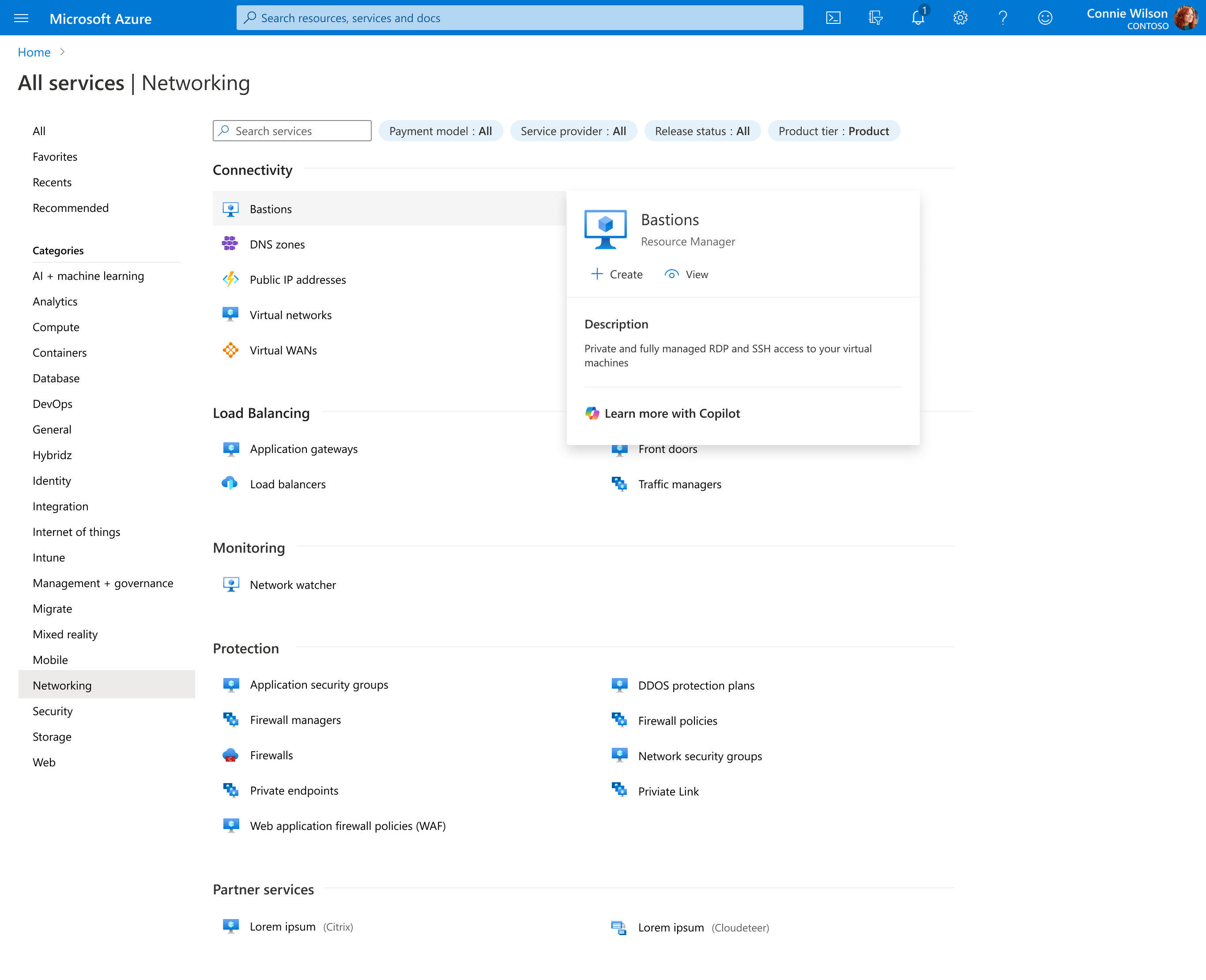
Visual Inconsistency
Each hub looked different, creating a fragmented experience across the portal. Hubs needed to align more closely with the portal homepage design language.
Design Highlights
Visual Refresh
We focused on the "Get started" tab, implementing consistent card-based layouts, clearer step indicators, and improved typography. The refresh maintained functionality while creating a more modern, cohesive experience. Below is an example from Azure Arc.
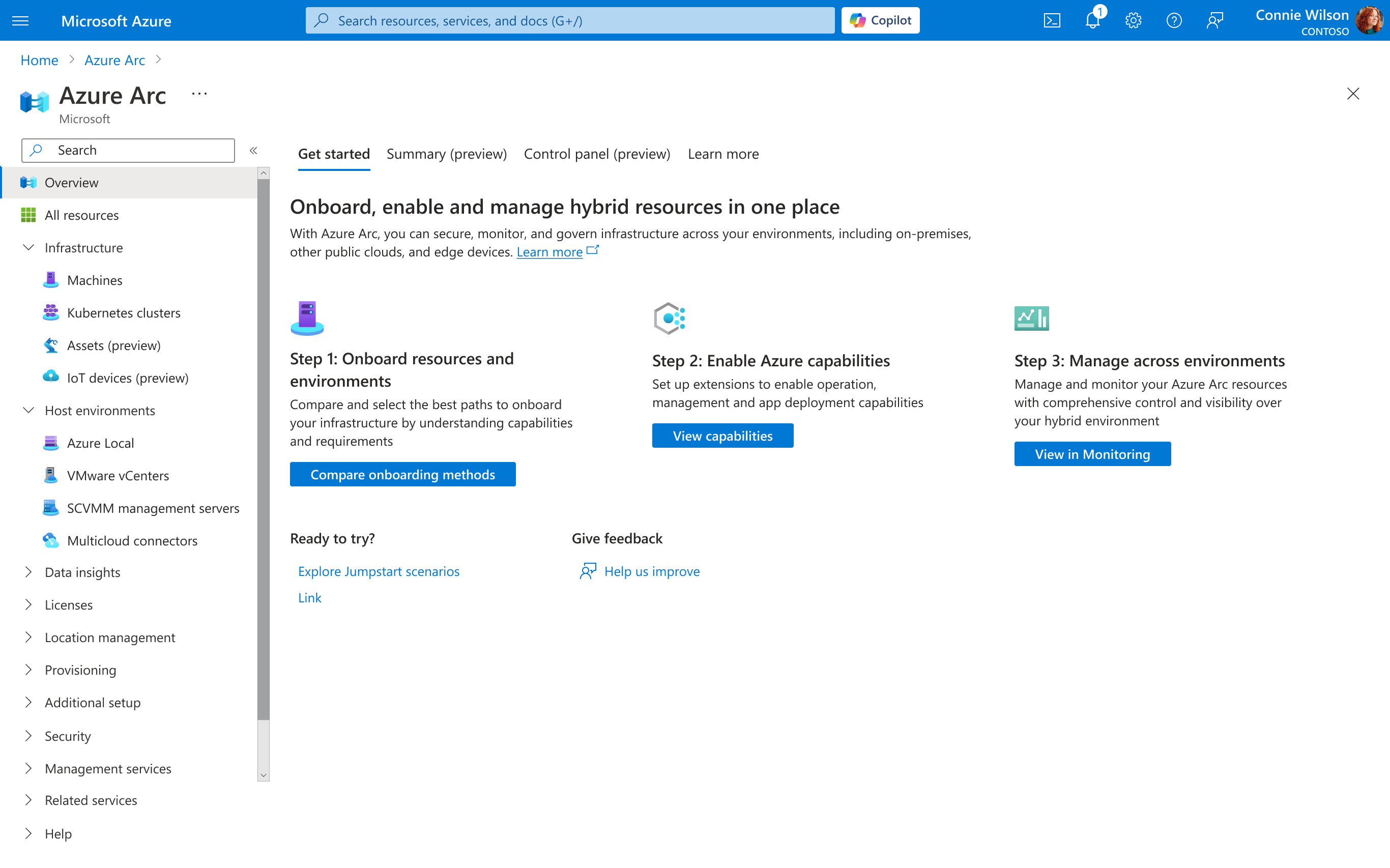
Before
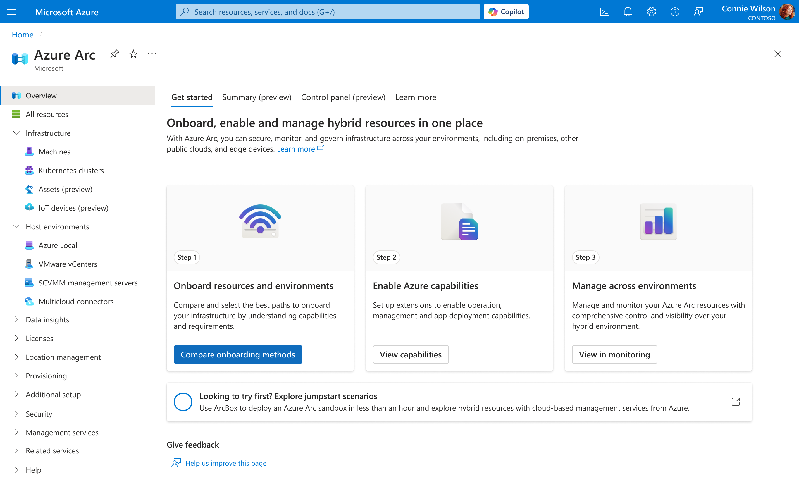
After
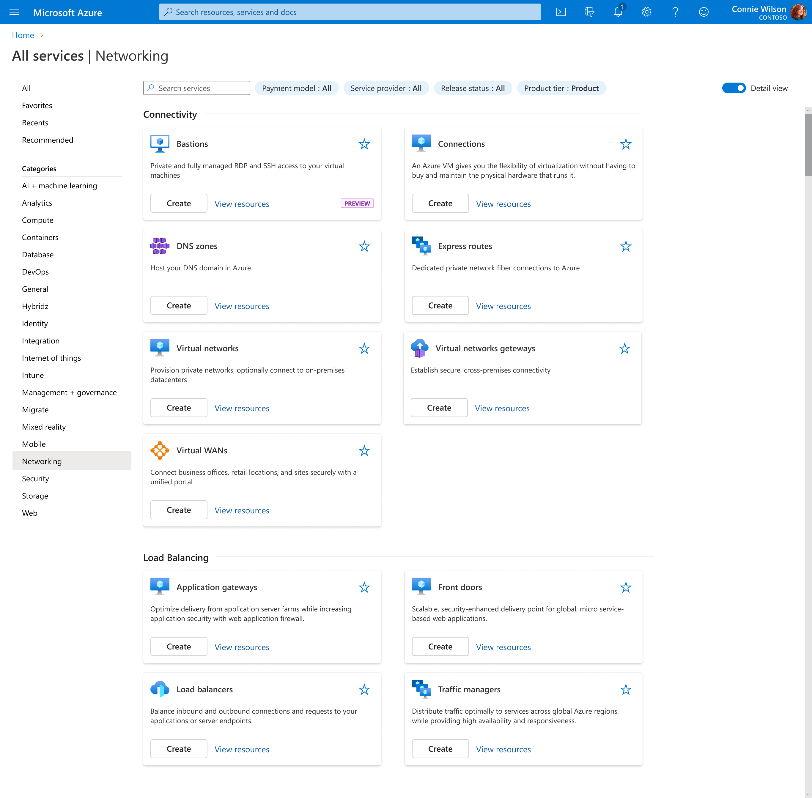
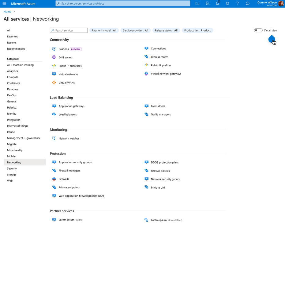
Scales Across Hubs
These patterns were designed to scale across all hubs. Below is an example from Compute Infrastructure—each hub could customize content while maintaining consistent structure, spacing, and interaction patterns.
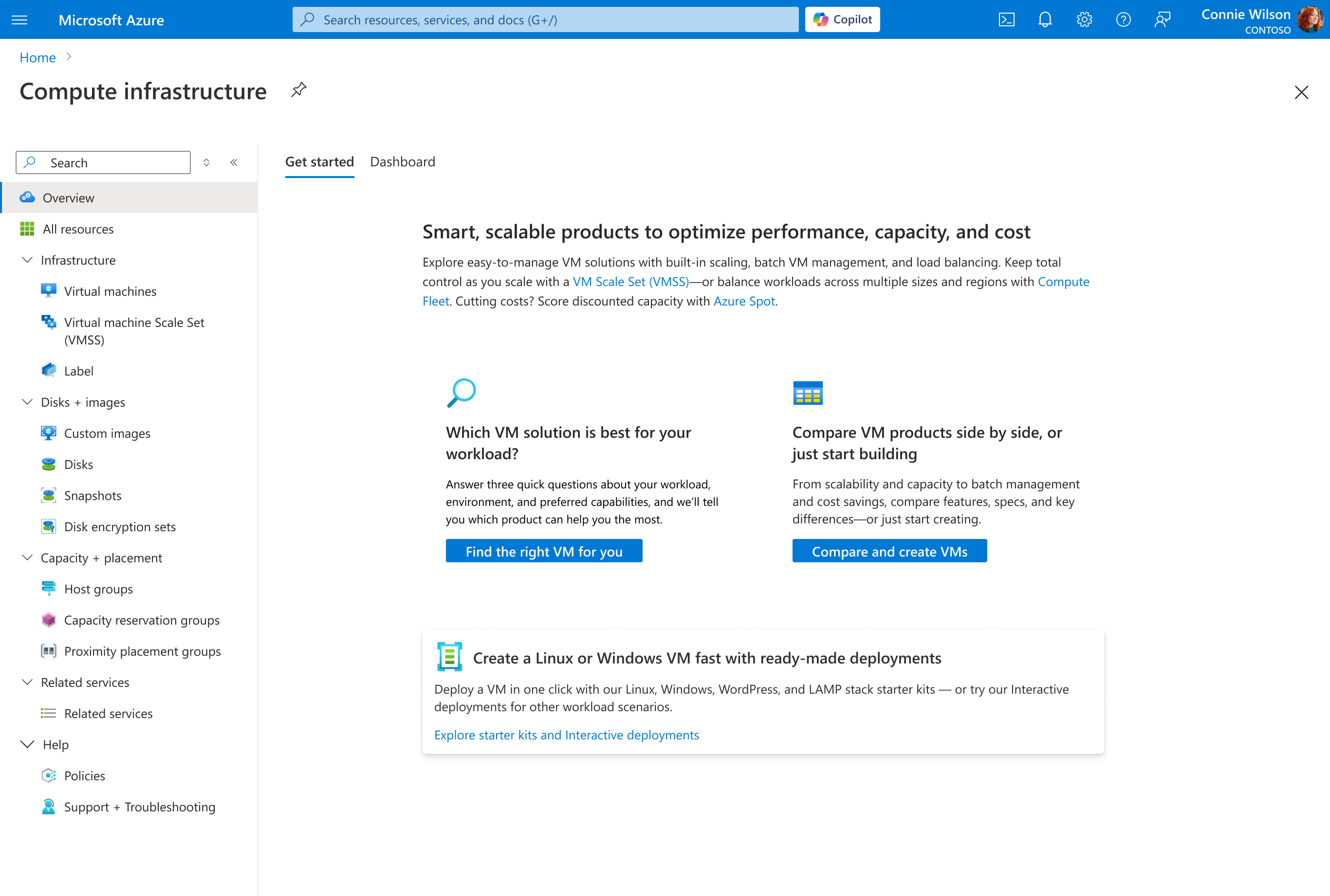
Before
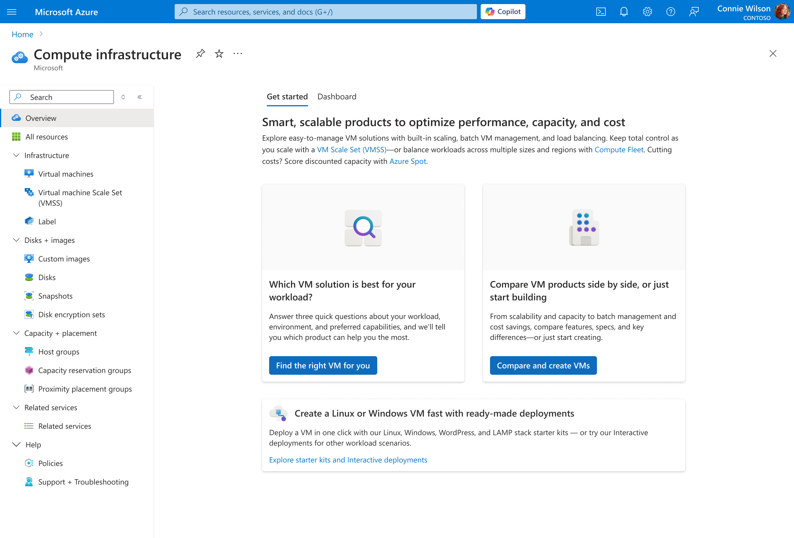
After